Categories
Research

Recreating Claude Bragdon’s New York Central Railroad Station

There used to be a beautiful train station in Rochester, New York.

rochester-ny-central-railroad-bragdon-stationThe Rochester train station and Greyhound Bus stop sit at the corner of Central and Joseph Avenues, just north of Rochester’s infamous “inner loop,” a beltway that encircles downtown Rochester. Both the inner loop and the current transportation center are infrastructural eyesores and civic blunders. While the inner loop was intended to alleviate congestion and increase traffic flow in downtown Rochester, the city’s subsequent contraction has rendered the beltway effectively useless. Conversely, as train travel decreased throughout the post-war era, there was little need for grandiose train terminals. Like many other stations built during the early years of the twentieth century, the original Rochester train station was destroyed and replaced by what stands in its place today.

Categories
Research

The Seward Family Letters

seward-family

My entrance into the Digital Humanities is playing out in two complementary acts. The first, as a Mellon fellow, provides me with theoretical and technological training. The second stage of my digital humanities involvement is with the Seward Family Project – a hands-on application of how to “do” DH.

Categories
Blog Research

Blake Archive Forever

As Mellon Fellows, Eitan, Serenity, Chris, and I have been semi-strategically embedded into a few faculty research projects that feature strong digital characteristics. We’re there to assist and learn as much as possible.

Since I had already attached myself to the William Blake Archive when I first arrived at UR last year, it was decided that I would continue with Blake and take on more challenging projects.

In one respect, working with the Blake Archive is a considerably different endeavor than working with the other affiliated projects because, well, it’s been around forever (in DH-years). As a landmark editorial project first conceptualized in the early ‘90s–the first digital edition to receive MLA’s “CSE Approved Edition” seal in 2005–the Blake Archive has been subsequently scrutinized as a case study in countless theoretical and pragmatic contexts.

Categories
Blog Research

Digital Mapping and the “Sense of Place”

Map overlay

The fetid musk of South Side slaughterhouses, the eclectic sprawl of Dublin, the muck of the Everglades: these sensual ambiences enwrap readers of The Jungle, Ulysses, and Their Eyes Were Watching God. Between those pages, space and atmosphere seems to “thicken, take on flesh,” as Mikhail Bakhtin wrote. These novels are exemplars, of course, but in general we don’t hesitate to label great fiction “immersive”; prose, at its best, can produce a powerful corporeal experience as well as a cognitive one. Why are we are reluctant to believe that historiography could do the same?

Historical research, we presume, benefits from coolness, neutrality, and critical distance. But the appeal to a sense of place, not just describing but making palpable distant or bygone scenery in all its spatial and social complexity, is not the responsibility of novelists alone. Reenactors, cultural preservationists, and open-air museum curators have demonstrated for more than a century that interactive history has not only entertainment value but also real heuristic potential, and it’s refreshing to work among academic historians eager to enrich historical narrative on—and beyond—the printed page.

For digital humanists working on histories of space and place, representing practice appears to be the current frontier of the technologically possible. Practice is French Marxist geographer and cultural critic’s Henri Lefebvre’s term, one of three composing the iconic “spatial triad” he unveils in The Production of Space. By practice, he refers not to the perceivable patterns and physical structures that demarcate our lived environments—Chicago’s elegant gridiron, for example, or the boggling angles and inclines of a suburban parking garage—but rather to the everyday activities that inform and shape our experience of space. Out of the mute fabric of open terrain, we sew complexly textured quilts of public and private meaning sensible only to us; memory and affect attach themselves to familiar sites and await their resuscitation each time we draw near.

Tangible patterns and structures are, of course, rather easily reproducible in virtual space. Many digital humanities projects succeed in generating multilayer, customizable, information-dense, yet highly legible maps that show, for example, patterns of German-Jewish emigration or mafia territory during Prohibition. These interactive diagrams are inarguably useful, and can provide necessary context and a sense of scale to otherwise dry historical narratives. But experience and memory remain notoriously hard to incorporate into digital interfaces. The challenge today is to push digital mapping technologies (also known as Geographic Information Systems, or GIS) beyond the ontic limitations of the map, before the map “pushes us back,” as Lefebvre predicted “towards a purely descriptive understanding” of history.

As an Andrew W. Mellon Fellow in Digital Humanities, I have the good fortune to work with Dr. Michael Jarvis, a historian at the University of Rochester specializing in the Atlantic maritime world, in particular the cultural and geopolitical role played by Bermuda during the eighteenth and nineteenth century. Virtual St. George’s, his ambitious, year-old digital history project, makes use of multiple mediums and platforms—architectural rendering, digital cartography, drone photography, 3-D scanning—in an effort to electronically, interactively, immersively reconstruct space-as-experienced and life-as-lived across multiple eras in St. George’s, the colonial capital of the mid-Atlantic island. Jarvis summarizes the project’s objective best:

The project’s various historicized 3D townscapes will help visitors visualize how St. George’s evolved through adaptations to environmental change, world events, fluctuating global markets, local demographic shifts and architectural influences. Engagement can vary from particular exploration of individual building interiors using probate inventories (like a virtual house museum in the style of Colonial Williamsburg, Sturbridge Village, Greenfield Village) to an open-ended urban exploration of the town’s docks, warehouses, and streets filled with animated St. Georgian avatars. We plan ultimately to incorporate game-play missions (such as delivering letters to a royal governor, haggling with a ship captain or merchant, aiding an enslaved sailor to escape) to engage users of different ages in order to give direction and purpose to their spatial explorations, teach social science skills, and represent historical realities.


I see Virtual St. George’s as more than an opportunity to experiment with historical storytelling methods, and to spark conversation about the potentials—and practical limits—of the virtual sensorium. It will also model for the interoperability of multiple DH platforms that are now primarily used in isolation, and demonstrate the value of the virtual to preservationist efforts. As the Virtual St. George’s graduate assistant, I’ll be blogging here in the future about the project’s progress, as well as about the intersections and interstices of digital history, video games, virtual reality technology (e.g., Oculus Rift), drone photography, critical theory, and phenomenology.

Eitan Freedenberg is an Andrew W. Mellon Fellow in Digital Humanities and a PhD student in the Graduate Program in Visual and Cultural Studies at the University of Rochester.

Categories
Blog Research

Prime Time: Diving into TV Guide

tvguidehabit

In its first semester, Televisual Time encountered some of problems that face many DH projects, specifically around securing a data set; after all, the time-sensitivity of TV Guide epitomizes the ephemerality of the weekly magazine. Case in point: we procured the first few decades on microfilm, but they were reproduced at such a small scale—up to 4 pages vertically per 35mm reel—that they were difficult for us to read, let alone a computer. The next stop, both oddly and predictably, was eBay, where we procured a selection of issues from each decade at random. Our next step was to scan these issues and submit them to OCR, a task that has proved to have its own complications on account of typeface, symbol usage, and the presence of advertising, to name only some issues. 

1998 grid

To the extent that preparing these files for digital analysis remains very much a work in progress, this semester as well as last, our work so far has taken a different page from Williams’ work, which is that of distribution. In his 1973 analysis, Williams worked with a selection of categories: News, Documentaries, Education, Arts and Music, Children’s Programs, Drama, Movies, General Entertainment, Sport, Religion, Publicity, and Commercials. He doesn’t say where his “conventional” categories come from, but for us, TV Guide’s evolving categorization of programming offered a fairly straight-forward mode of reading. In view of our interest in time, we calculated the general distribution of programming, according to contemporary TV Guide categories, in one issue from each decade, and constructed (admittedly rudimentary) charts to display our results.

genre 1953 genre 1966 genre 1977 genre 1985 genre 1998 genre 2001

I say “fairly straight-forward” because even this is not entirely so. Throughout its decades-long run, TV Guide’s categorization of shows is inconsistent and incomplete: not every show gets a category. Upon cursory examination, it seems possible that categories were more often applied to less popular shows—or perhaps local ones—and left off for well-known shows, putting a premium on “culturally relevant” information rather than comprehensive detail. In the 2000s, the magazine has stopped providing genres at all except for movies, the genres for which are distinctly fewer in number.

comedy time

That being said, there are some interesting trends to note that we hope to explore through further analysis. As one example, the chart in the 1980s shows a dramatic uptick in comedies, a development we hypothesize owes to the expansion of cable and the concomitant increase of re-runs. Comedies, as serial shows, are perhaps the most easily syndicated, since they can continue to attract new audiences every week. But whether this is the cause or isn’t—a question still worth exploring—we can also ask how this distribution allows us to think about television’s structuring of time in this period. Thus, another way of thinking about the distribution of comedies is to calculate them in minutes: how long, with the aid of recording technology, one could spend watching all of the comedies on air in a given week. For 1998, this number—13,560 minutes—far exceeds the total number of minutes in a week, being 10,080. It’s an odd comparison, but striking nonetheless.

comedies

As Televisual Time develops, we hope that distant reading will bring new insight to these kinds of qualitative questions and, in turn, to a different way of looking at television’s changing presence over time.


Tracy Stuber is a PhD student in Visual and Cultural Studies at the University of Rochester. She is a 2015-2017 Andrew W. Mellon Fellow in the Digital Humanities.

Categories
Blog Research

Research Report: The Family We Thought We Knew

How Digital Annotations Challenge Historians’ Assumptions

Categories
Blog Research

Learning As We Go Along

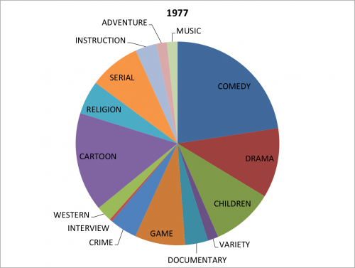
DH projects can be fickle beasts. Of course, any sort of research can be unpredictable. Progress often comes in fits and starts and the path forward is rarely clear. Unforeseen obstacles are part of game. But the application of digital methods to humanistic questions adds a twist. Digital tools have a life all their own and sometimes things don’t go as planned.

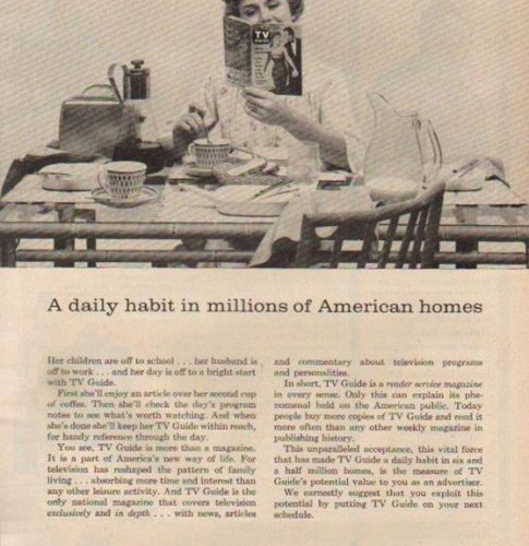
I encountered this personally when working with Dr. Joel Burges on his Televisual Time project. The aim of the project is to employ digital, distant reading techniques to TV Guide Magazine in order to discover how time is structured in and through televisual experience. Like many digital projects, the first step was to build a data set.

Two possibilities for building the data set presented themselves. The first was to transcribe the content by hand, an inconvenient and time-consuming prospect. Thus, since hand transcription wasn’t a live option, a second course was chosen. This involved scanning paper copies of TV Guide and employing Optical Character Recognition (OCR) technology to generate searchable text from the images.
Tracy Stuber, who preceeded me as research assistant for the TV Guide project, started the process. She scanned a selection of TV Guide issues and made some first attempts at running OCR software on the images.

But the task of generating a searchable text version of the scans proved surprisingly difficult. Tracy made the first attempt to run OCR software on the scans using the OCR built into Adobe Reader. But the results were mixed. Take for example, page 5 from the May 1-7 1953 edition.

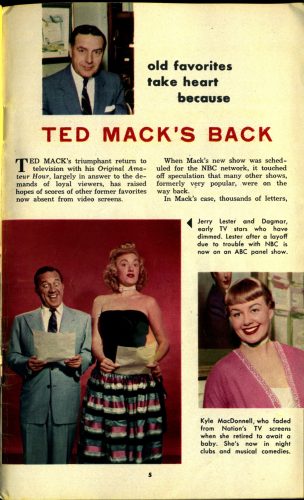
Notice the layout of the page. The stylized title of the article, the multiple columns of text, the images laid out with captions. These visual features, while very familiar to the modern, human eye, proved to be only somewhat readable by a machine. Here is what Adobe’s OCR technology delivered when run on this page:


old favorites
take heart
because
TED MACK’S BACK
T
ed mack’s triumphant return to
television with his Original Amateur
Hour, largely in answer to the demands
of loyal viewers, has raised
hopes of scores of other former favorites
now absent from video screens.
When Mack’s new show was scheduled
for the NBC network, it touched
off speculation that many other shows,
formerly very popular, .were on the
way back.
In Mack’s case, thousands of letters,

There is a lot that worked well here. We have some strange artifacts like the hard break after “T” and the extra period added between “popular” and “were” in the third-to-last line, but the text is largely in good order. But notice that the image captions were completely omitted. The program didn’t even register these at all. A puzzling outcome, possibly due to the lay out of the captions. But this was a harbinger of things to come. For although the OCR seemed to work fairly well on articles like this one, the core of TV Guide Magazine is the schedule. And here things got worse. Take for example, this page from the same issue.

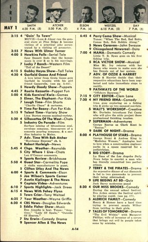
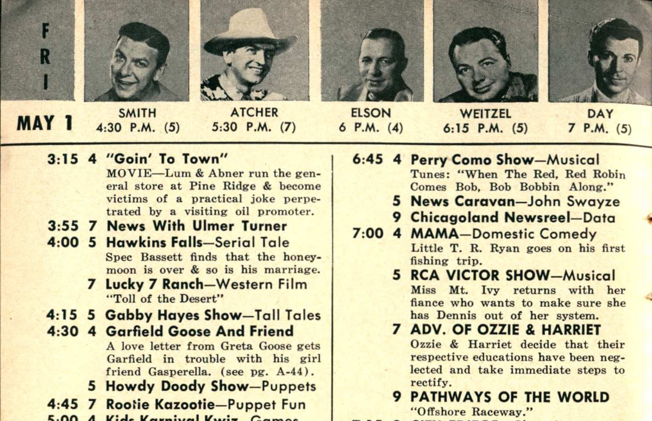
Here’s a close-up of the top of the page.

Note the elaborate visual structure. The top of the page includes captioned images to feature certain programs. The schedule itself is laid out in such a way as to make things easy to understand, but hard for a machine to process. For instance, we have a column indicating the time, a column indicating the channel, and a column listing the program with a description. But the times aren’t repeated for each show. And not every channel airs a program at every time. This visual structure is completely lost on the OCR technology. Here is an excerpt of the Adobe OCR of this page.


FR
MAY 1
3:15
3:55
4:00
4:15
4:30
4:45
5:00
5:15
5:30
5:45
5:50
6:00
6:10
6:15
6:25
6:30
SMITH ATCHER ELSON WEITZEL DAY
4:30 P.M. (5) 5:30 P.M. (7) 6 P.M. (4) 6:15 P.M. (5) 7 P.M. (5)
4 "Goin' To Town"
MOVIE—Lum & Abner run the general
store at Pine Ridge & become
victims of a practical joke perpetrated
by a visiting oil promoter.
7 News With Ulmer Turner
5 Hawkins Falls—Serial Tale
Spec Bassett finds that the honeymoon
is over & so is his marriage.
7 Lucky 7 Ranch—Western Film
“Toll of the Desert”

Obviously, we’ve got some problems. The OCR read the times as a separate column but still separated them with hard returns. This completely divorces the times from the listings. It then included the names from the featured programs at the top, this time reading them all as one line while the times associated are, once again, separated from their targets. Things go a bit better when we consider the text of the programs. Here, at least, we get the full sentences, with proper capitalization, and the associated channel listing. But this information doesn’t do much help without connecting listings with their times.

At this point, I attempted a switch in technologies. Google produced an application called Tesseract which is now open source. I was hopeful that Tesseract might be able to improve upon things. Alas, it was not to be. Here’s Tesseract’s output on the same passage. Forgive the length, I wanted to portray the output as it was when it was generated.

MAY I
3:I5

3:55
4:00

4:I5
4:30

5:15
5:30

5:45

5:50

6:00

6:10
6:I5

6:25
6:30

4:30 P.M. (5)

4

VIN

("8 00 NM‘NUI

UthlUIAVOVUlhul .Q Who N

7
9

SMITH
5:30 P.M. (7)

"Goin' To Town"

MOVIE—Lum & Abner run the gen-
eral store at Pine Ridge & become
victims of a practical joke perpe-
trated by a visiting oil promoter.

News With Ulmer Turner

Hawkins Falls—Serial Tale

Spec Bassett finds that the honey-
moon is over & so is his marriage.

lucky 7 Ranch—Western Film
“Toll of the Desert"

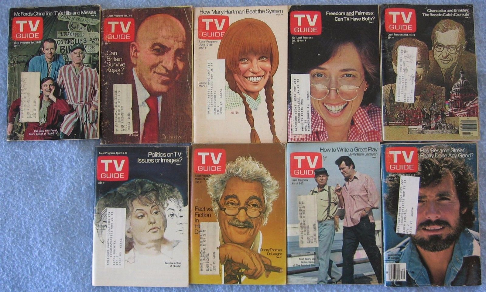
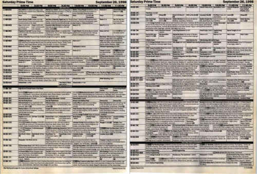
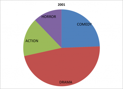
Here, we discover even more problems! And things only get worse when we run more recent issues through the OCR. Take this page from a 2001 edition of the magazine.

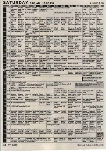
And here, in its entirety, is the text obtained from this page via one of the OCR runs:

SATURDAY 6:00AM-12:00PM AUGUST18
48 I TV GUIDE Oakland Rebuild (8044/03)

That’s it. Just two paltry lines. And literally none of the information from the grid was even registered as characters, let alone correctly. Other pages with a similar structure produced semi-readable results, but Tesseract didn’t see what the human eye sees: the grid structure. So the text read straight across the line without consideration for the lines dividing the cells.

All of this led me to the inevitable conclusion. Our data set was not going to be created via the OCR technologies in their present state. And, given how much time hand entering the data would take, the prospect of obtaining a usable data set for a distant reading approach seemed a pipe dream. So Dr. Burges declared the experiment over and moved on to a different research method. And I walked away having learned about the limitations of OCR technologies, the complexity of visually displayed data in print formats, and the way that DH projects have a life of their own.
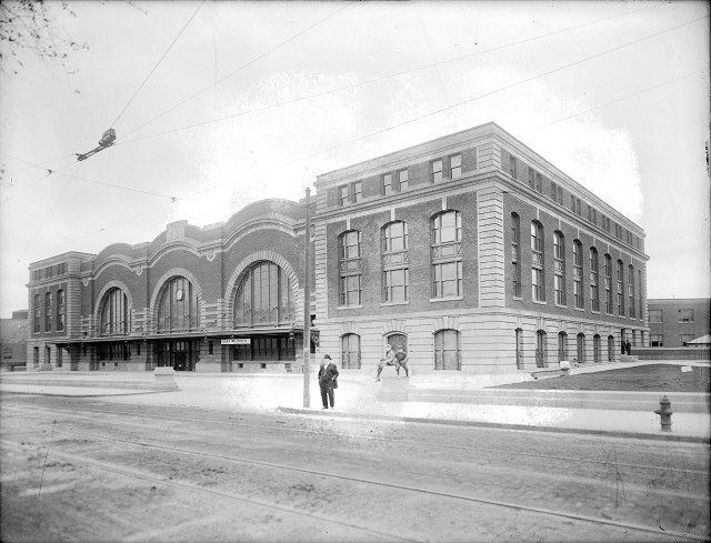
Categories
Blog Research

Exploring Digital Heritage

Photogrammetry is a process in which several images of an object, building, or landscape are digitally stitched together to create a three-dimensional representation. By collecting a series of images from different depths and angles historians can recreate historic structures and landscapes as tools for historical interpretation, argumentation, as well as a device for learning. While the capabilities of photogrammetry are wide-ranging, historians most commonly use photogrammetry as a tool for the collection and preservation of cultural heritage. The ability to capture building designs, historic structures, and other objects provides historians with the tools to revisit and interpret historical spaces well after technological advances or natural processes change the shape of objects and landscapes.


Walking through the historic Mt. Hope Cemetery in Rochester, New York I stumbled upon the grave of George W. Stebbins. After taking a series of pictures from different vantages, I compiled to files into Agisoft PhotoScan. One of many programs programed to reconstruct photographs into three-dimensional objects, Agisoft Photoscan identifies similar features in each photograph and compiles them object according to shared features. By creating a mesh of the compiled images, I then constructed an object that can be twisted, turned, and examined more dynamically than a traditional photograph.


The construction of the three-dimensional grave provides a digitally accessible object that otherwise may be inaccessible because of geography and funds. Collecting a series of objects serves as both a means of cultural resource management and a vehicle in which to compile historic evidence in new and compelling ways. For example, the Virtual St. George’s Project housed at the University of Rochester uses historic inventories, architectural drawings, and archaeological findings to reconstruct eighteenth-century St. George’s Bermuda. Students and project participants are building a rich database of historic information while also creating a game-like interface to demonstrate the significance of Bermuda in the eighteenth-century Atlantic World. Using photogrammetry and other three-dimensional rendering technologies historians can save, restore, and share historical information in dynamic and interactive ways.


Camden Burd is a PhD candidate in the Department of History at the University of Rochester. He is a 2016-2018 Andrew W. Mellon Fellow in the Digital Humanities.

This post was originally published on his personal website with interactive 3D viewer. See more here…